Ever wondered how the small graphs are shown in the cells in excel. These are used to show small trends for many different values, which can be easily understood with these views. e.g. in case of stock company values these charts can be use to show the market trends.

Below are the guidelines to create the spraklines charts in cell :
 1. To make use of sparklines, select the cell where we need to place the tiny graph.
 3. Once you choose the type, you will get a pop-up message to choose the Target cell and the Data Range.

There is a new feature introduced in the Microsoft Excel 2010 which helps you to insert the graphs in cells. This new feature is the sparklines for a single cell. Using these sparklines you can now create tiny integrated graphics within each cell. These sparklines can be easily used to detect patterns of the data tables. This is a very simple and quick feature, to highlight important trends in the that data (such as seasonal increases and decreases).
1. To make use of sparklines, select the cell where we need to place the tiny graph.
2. Then, click on the Insert tab àsparklines. here you have 3 types of charts to choose Line , column and gain or loss.
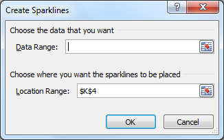
3. Once you choose the type, you will get a pop-up message to choose the Target cell and the Data Range.
4. Update the data range, where your data is present update the cell number in Location Range, where you need to see your graph.
5. Once the range is updated and you click ok, the graphs are generated instantly in the location range.
The choice of the sparkline chart type seems more visual in the online format. The format with gain or loss is very suitable for interpreting balance sheets.
It is very fast, simple and intuitive interpretation of the data table, identify trends and monitor developments. The graphs which were initially quite difficult to read as a set of numbers has now become easily understandable.
No comments:
Post a Comment